With more people browsing the internet on smartphones and tablets, mobile optimization has become an important part of modern SEO. A website that works well on mobile devices can provide a better user experience and make it easier for visitors to access content, products, or services.
Search engines want to deliver results that are useful and accessible across different devices. As a result, websites that perform well on mobile often provide a better experience for users and support long-term SEO efforts.
In this guide, you’ll learn what mobile SEO is, why it matters, and how beginners can optimize their websites for mobile users.
What Is Mobile SEO?
Many website owners spend time improving content and design but overlook how visitors actually experience the site on a phone. A page that looks great on a desktop monitor may feel completely different on a smaller screen. Taking time to review your website from a mobile visitor’s perspective can reveal issues that might otherwise go unnoticed.
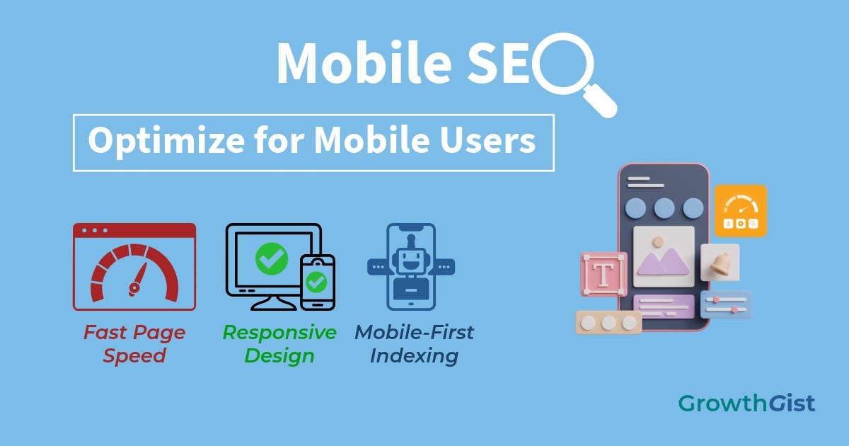
Mobile SEO is the process of optimizing a website so it performs well on smartphones and other mobile devices.
The goal is to ensure that users can easily read content, navigate pages, and interact with a website without frustration.
Mobile SEO involves several factors, including responsive design, page speed, usability, and content accessibility.
A mobile-friendly website helps visitors access information quickly regardless of the device they use.
Why Is Mobile SEO Important?
Mobile devices are often used in situations where users need information quickly, such as while commuting, shopping, traveling, or comparing products. In these moments, convenience matters. Websites that make information easy to access can create a more positive experience and encourage visitors to return in the future.
A large percentage of internet users now browse websites through mobile devices.
If a website is difficult to use on a smaller screen, visitors may leave and look for alternative sources of information.
Mobile SEO can help:
- Improve user experience
- Increase engagement
- Reduce bounce rates
- Improve accessibility
- Support search visibility
A positive mobile experience benefits both users and website owners. This is especially important for businesses that rely on local customers searching from mobile devices.
Many visitors form an impression of a website within seconds. A slow or poorly optimized mobile experience can make it difficult to retain those visitors.
Understanding Mobile-First Indexing
Google primarily uses the mobile version of a website when evaluating and indexing content.
This approach is known as mobile-first indexing.
Google provides additional information about mobile-first indexing and how it affects website evaluation.
Instead of focusing on a desktop version, search engines analyze how content appears and functions on mobile devices.
For this reason, website owners should ensure that important content, images, and navigation elements remain accessible on smaller screens.
Use a Responsive Website Design
Responsive design allows a website to adapt automatically to different screen sizes.
This helps maintain a consistent user experience across desktops, tablets, and smartphones.
Responsive websites typically provide:
- Flexible layouts
- Better readability
- Improved navigation
- Consistent content presentation
A responsive design reduces the need to create separate versions of a website for different devices.
Improve Mobile Page Speed
Page speed plays an important role in the overall user experience.
Mobile users often expect websites to load quickly, especially when using slower internet connections.
Several factors can influence page speed:
- Large image files
- Excessive scripts
- Unoptimized code
- Too many unnecessary elements
Improving website performance can help visitors access content more efficiently.
Even small improvements in loading speed can contribute to a smoother browsing experience. Tools like PageSpeed Insights can help identify performance issues and optimization opportunities.
Optimize Content for Mobile Readers
Content should be easy to consume on smaller screens.
Visitors should not need to zoom in repeatedly or scroll horizontally to read information.
Consider the following practices:
- Use short paragraphs
- Break up large blocks of text
- Use descriptive headings
- Maintain adequate spacing
- Use readable font sizes
These adjustments can improve readability and make content more accessible.
Improve Mobile Navigation
Navigation should remain simple and intuitive on mobile devices.
Visitors should be able to locate important pages without confusion.
Good mobile navigation often includes:
- Clear menus
- Logical page structure
- Easy-to-tap buttons
- Consistent navigation elements
A well-organized website helps users find information more quickly.
Optimize Images for Mobile Devices
Images contribute to both visual appeal and user experience.
However, large image files can negatively affect loading speed.
Website owners should:
- Compress images
- Use appropriate dimensions
- Choose efficient file formats
- Provide descriptive alt text
Optimized images can improve performance while maintaining visual quality.
Avoid Common Mobile SEO Mistakes
Beginners often make mistakes that reduce the effectiveness of mobile optimization.
Common issues include:
- Slow-loading pages
- Small text sizes
- Poor navigation
- Intrusive pop-ups
- Unoptimized images
Addressing these issues can help improve the overall mobile experience.
Mobile SEO and User Experience
Mobile SEO and user experience are closely connected.
A website that loads quickly, displays properly, and offers easy navigation is more likely to satisfy visitors. Providing a reliable mobile experience can also support trustworthiness, which is an important part of E-E-A-T.
Improving usability often benefits both search performance and audience engagement.
Rather than focusing solely on rankings, website owners should prioritize creating a smooth and accessible experience for mobile users.
Improving mobile usability does not always require major redesigns. Small adjustments, such as simplifying page layouts, improving button placement, or reducing unnecessary visual elements, can make a noticeable difference. Consistent improvements over time often lead to a smoother experience for visitors.
How to Measure Mobile Performance
Several tools can help evaluate mobile usability and performance.
Website owners can also use Google Search Console to monitor mobile-related issues and performance data.
These tools can identify issues related to speed, usability, and overall website quality.
Regular testing allows website owners to discover problems and make improvements over time.
Monitoring performance is an ongoing process that helps maintain a positive user experience.
As technology continues to evolve, user expectations also change. People increasingly expect websites to be fast, accessible, and easy to use regardless of the device they choose. Websites that adapt to these expectations are better positioned to provide value and maintain long-term audience engagement.
Final Thoughts
Mobile SEO focuses on improving how websites perform and appear on mobile devices. By optimizing design, speed, navigation, content, and usability, website owners can create a better experience for visitors.
As mobile usage continues to grow, investing in mobile optimization can help support long-term SEO efforts and improve accessibility for a wider audience. Beginners who prioritize mobile usability today can build a stronger foundation for future website growth.
GrowthGist was founded by Ishwar Solanki to provide clear, practical, and beginner-friendly content on SEO, blogging, AI tools, productivity, website optimization, and digital growth. The platform helps readers build valuable digital skills and strengthen their online presence through actionable insights and reliable information.